How clear and simple data visualizations bring the climate crisis home
By Rachit Dubey | July 25, 2025
 Illustration by Thomas Gaulkin (Brian A Jackson / Antonio Solano /depositphotos.com)
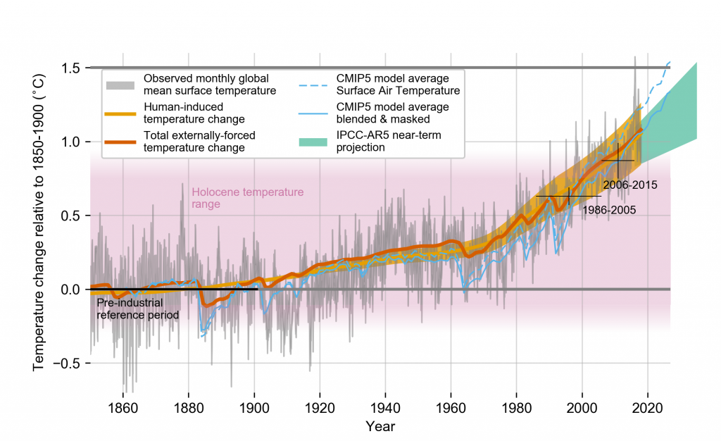
Data visualizations are some of the most powerful tools in a climate science communicator’s playbook. The most famous have taken on enormous symbolic value—like the “Hockey Stick” graph showing rising temperatures in the Northern Hemisphere since the year 1000.

But designing climate visuals that are clear to the public and policy makers is not a straightforward task. Many scientific graphics, such as those in reports of the International Panel on Climate Change (IPCC), are designed for technical accuracy and often assume a specialized audience. As a result, they can be difficult to interpret. Prior research has shown that widely used scenario graphs can confuse viewers. For example, people often mix up uncertainty about future emissions scenarios with uncertainty in the climate models themselves.
At the same time, there is growing evidence that more intuitive visualizations, informed by psychological research, can help people make better sense of climate data. For example, one study showed that simply highlighting rising temperatures in red increased support for climate action among liberal viewers.
This challenge—how to make climate visuals more meaningful to the public—was the motivation behind the recent study I published in Nature Human Behavior with my colleagues in Princeton’s computer science department. We wanted to know whether some kinds of data visuals can help make climate change feel more concrete and better reflect the urgency of the crisis.
We ran a series of experiments with over 2,000 participants. Each person was introduced to a fictional town and shown data about how its winters had changed over time. One group saw a standard chart showing a gradual rise in average winter temperature. The other group saw a binary chart indicating whether the town’s lake froze each year. Importantly, both charts reflected the same underlying climate trend. However, people’s responses were very different.
People who viewed the binary “froze or not” charts consistently rated climate change as having had a more severe and more noticeable impact on the town, compared to those who viewed the temperature charts. That is, when climate impacts are presented in black-and-white terms, people seem to take them more seriously.

An upward slope on a temperature chart may seem gradual or unimportant. But a switch from “lake froze” to “lake didn’t freeze” captures a threshold. Something that used to happen no longer does. That feels different. Personal.
Our findings call for a re-think about how we communicate climate change.

Rachit Dubey
Rachit Dubey is an Assistant Professor in the Department of Communication at UCLA, where he directs the Computational Cognitive Policy Lab. His ... Read More


Intergovernmental Panel on Climate Change

Ed Hawkins, National Centre for Atmospheric Science, University of Reading

Nadja Popovich, The New York Times

The Economist

Climate Central

RolfsWeather.github.io

Simon Jockers

Climate Central

Climate Central
Our usual ways of visualizing climate change can make its effects feel more abstract than they really are. But the changes are no longer subtle. We don’t need to overcomplicate the message. Often, the most effective visuals are the simplest ones: a lake that no longer freezes, an Arctic boundary that has visibly shrunk, a Christmas without snow.
What these examples share is a kind of visual simplicity. They don’t require viewers to interpret detailed numbers or statistical results to see what’s changed. Instead, they use contrast, familiarity, and visual structure—sometimes binary, sometimes categorical—to make the message easier to grasp. These are the kinds of cues that can help make climate change feel less like a slow drift and more like a rupture in the world as we knew it.
One of the clearest illustrations of this comes from an xkcd comic that plots Earth’s temperature over the past 22,000 years. For most of the chart, the line barely moves. Then, in the final few panels, it veers sharply upward. The message is simple and hard to unsee. You don’t need a legend or complicated analysis to get it. You just need to look.
Together, we make the world safer.
The Bulletin elevates expert voices above the noise. But as an independent nonprofit organization, our operations depend on the support of readers like you. Help us continue to deliver quality journalism that holds leaders accountable. Your support of our work at any level is important. In return, we promise our coverage will be understandable, influential, vigilant, solution-oriented, and fair-minded. Together we can make a difference.
Rachit Dubey
Rachit Dubey is an Assistant Professor in the Department of Communication at UCLA, where he directs the Computational Cognitive Policy Lab. His ... Read More
Keywords: IPCC, climate crisis, climate science, data visualizations, global warming
Topics: Climate Change
Recent Stories



check this out:
https://upload.wikimedia.org/wikipedia/commons/8/8f/Extrapolated_global_average_temperature_1970-2100.png
Very good points made. Good visualizations. However, the moving text makes it hard to scan and copy what one wants to remember and use.
Bob Horn, Author of the book Visual language.
It’s no good showing graphs to people who don’t understand how graphs work. If people could read a graph, there would be no debate. What is missing is the visualization of HOW heat reflects back to earth from “thin air” which many people barely perceive as having any substance at all, in addition to an explanation of what heat actually is (both conductive and radiative). This is what will give people the intuitive understanding of what is happening, qualitatively. Beyond that, a more quantitative understanding can be built by highlighting the permanence of CO2 in the atmosphere, which gives each… Read more »