Rebranding Chernobyl
By Julian Hayda | August 25, 2021
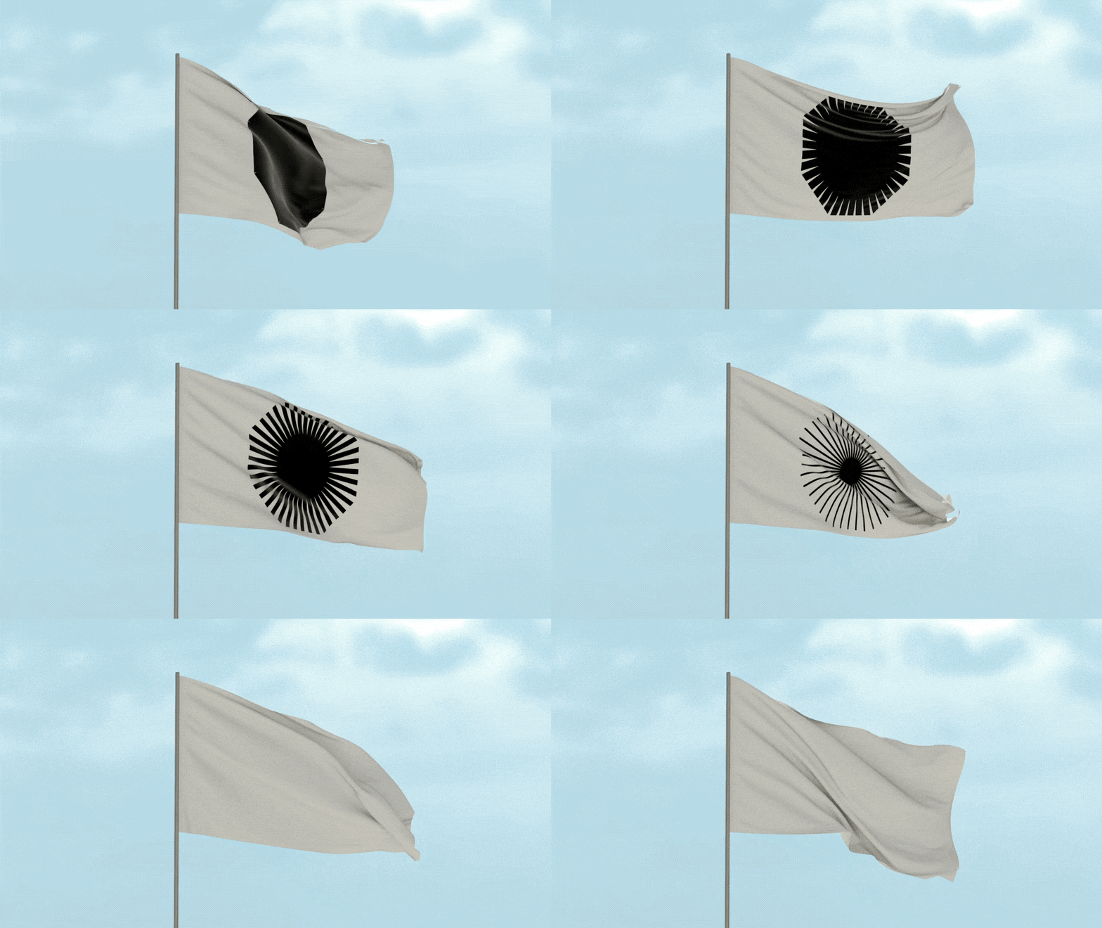
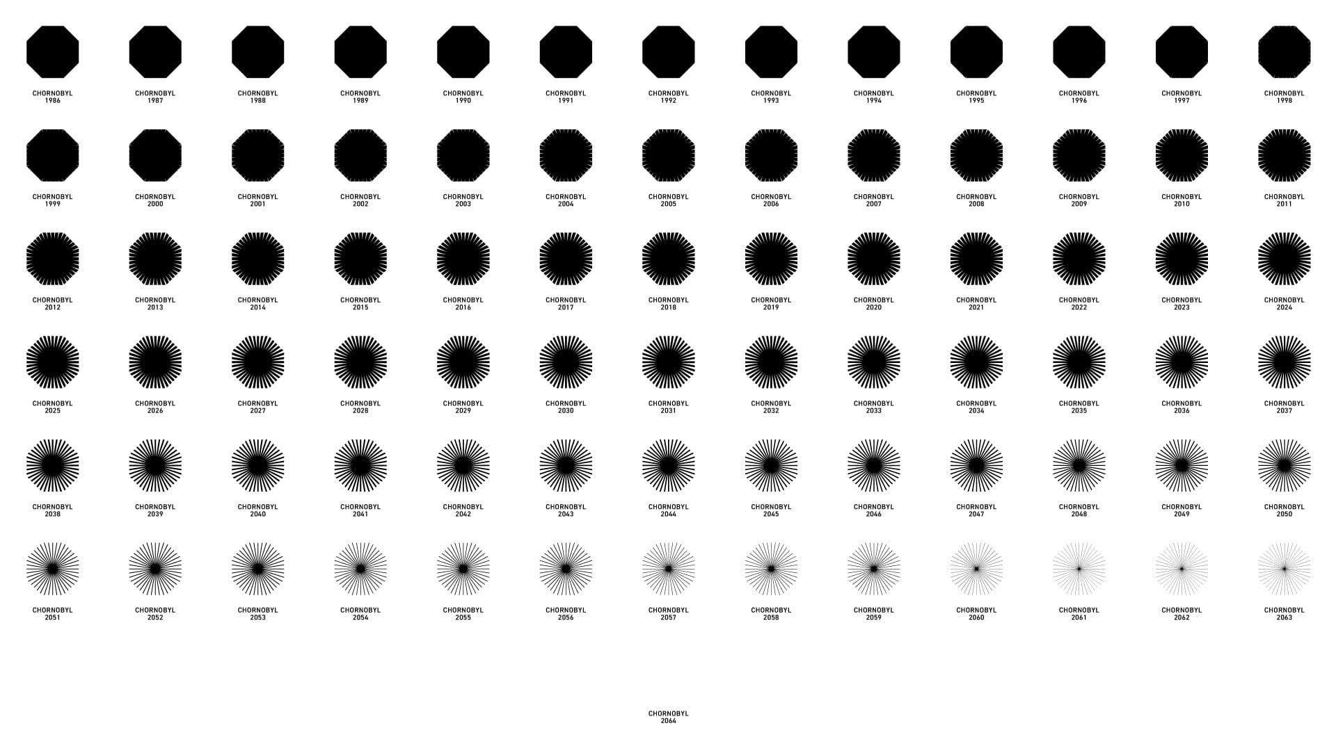
Animation depicting the full 78-year transformation of Chernobyl's new official logo. (Banda)
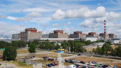
It has been more than 35 years since the fourth reactor at Chernobyl’s eponymous nuclear power plant exploded, killing dozens immediately, thousands in the aftermath, and rendering nearly 1,000 square miles uninhabitable in Ukraine and Belarus. Since Ukraine’s government first allowed tourists to visit the area in 2011, thousands of people have visited the abandoned cities and towns frozen in time, stood at the base of the reactor, and have witnessed the material effects of nuclear meltdown firsthand.
Chernobyl is just a two-hour drive north of the Banda design agency’s offices in Kyiv, Ukraine. When it came time to organize a company picnic in the summer of 2019, 20 graphic designers from the agency decided to pile into a bus and head straight for the site of the world’s worst nuclear accident. The HBO historical drama about the disaster had just been released, piquing curiosity around the world, including locally. The tour of the site was the first time many of Banda’s young designers had thought much about the radioactive legacy all around them and the gravity of what transpired at the former nuclear power plant.
Moved by what they saw, Banda representatives reached out to the Ukrainian government agency responsible for managing the 19-mile-radius Exclusion Zone around Chernobyl with an unusual proposal: a visual brand for Chernobyl and its legacy. At a time when Ukraine’s government has struggled to gain the world’s attention amid a seven-year war with Russia, an unresolved refugee crisis, a suppressed economy, an embarrassing supporting role in the first impeachment of Donald Trump, Carpathian mudslides, and forest fires near Chernobyl, authorities jumped on the opportunity for a free rebranding.
“People associate Ukraine with war and corruption ... and there’s a lot of myths about mutants in Chernobyl,” said Danya Nesterevych, one of Banda’s lead designers on the project. “We wanted to tell the world that there is a lot to learn from the rebirth of Chernobyl, and that there are a lot of important scientific and cultural dimensions to it.”
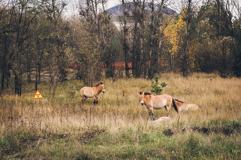
While a majority of visitors come to immerse themselves in the ruins of Chernobyl’s Soviet Atompunk landscape, some also explore the culture that long predates the nuclear era. Chernobyl was an important city in the development of Hasidic Judaism, for example. The densely wooded areas, rare for most of Ukraine, shielded tectonic political rebellions for centuries. And in the aftermath of the reactor meltdown, a process identified by scientists as among the most “iconic natural experiments on rewilding in recent history” has led those forests to now teem with wildlife unlike any else seen in Eastern Europe. Researchers return year after year to document everything from large mammal adaptation to earthworms. Meanwhile, artists have staged dance parties and light shows in the abandoned buildings. Countless films have been shot on location, some nuclear themed, others not.
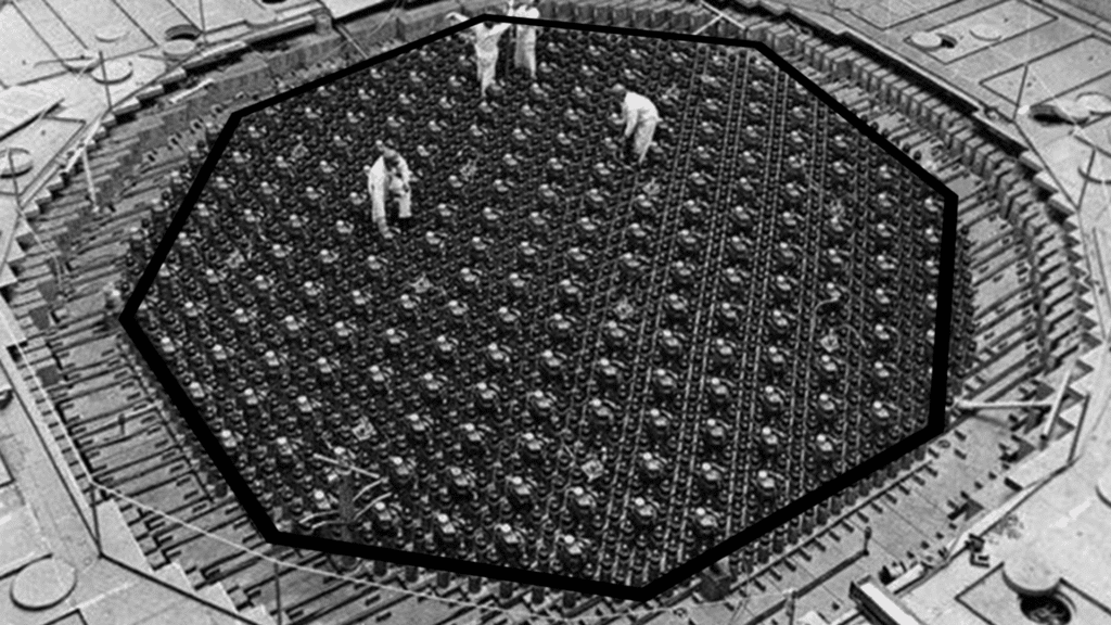
Unlike the international radiation trefoil that loudly litters a lot of Chernobyl-related materials, the Banda team proposed a more reserved design: a deceptively simple black octagon modeled after the silhouette of Chernobyl’s RBMK reactor core as seen from above.
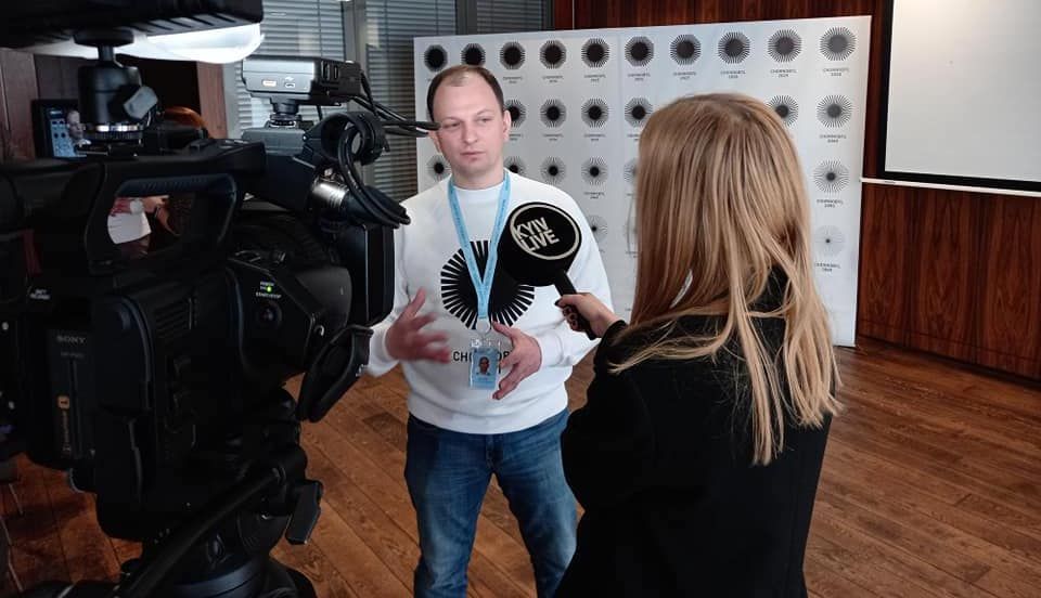
“I use the logo all the time, and it doesn’t turn people off like a violently orange radioactive symbol,” said Maksym Shevchuk, deputy head of the State Agency on Exclusion Zone Management. He finalized the previous Ukrainian administration’s agreement to work with Banda. Emergency responders, employees of the former power plant, and various other stakeholders also had a chance to weigh in.
“The logo was supposed to be unique, just like everything in the Exclusion Zone is unique,” Shevchuk said.
What most distinguishes the logo may be the fact that it changes over time—just like Chernobyl does. In 1986, the reactor exploded; by 2064, the Ukrainian government hopes to finally dismantle and dispose of the power plant entirely. Meanwhile, the buildings inside of the Exclusion Zone, including the city of Pripyat, have been deteriorating and will also be either demolished or overtaken by nature in the coming decades.
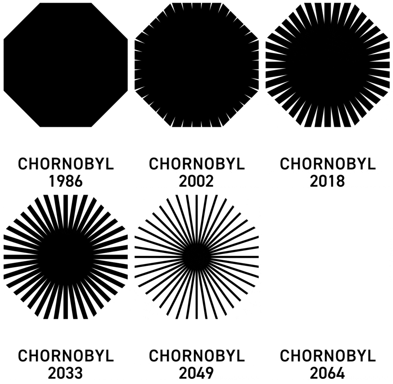
Reflecting these changes, Banda’s logo is really a series of 78 logos—one released every year—with slices of it disappearing each year, until the image is totally gone. The logo for 1986, the year of the disaster, is a complete, black octagon. The logo for 2064 is a white void. There’s supposed to be a logo there, but it’s invisible—perhaps like radiation, which the eye can’t really see, but is nonetheless ever-present in the lives of those affected by the Chernobyl disaster.
Roughly 55 percent of the octagon logo remains visible for 2021, the missing pieces radiating from the center. Next year, only 53% of the visible portion will remain.
“It's extremely effective,” said Armin Vit, editor of the graphic design criticism blog Brand New. “I think Banda was able to find something unique to Chernobyl. It’s iconic, it’s memorable, and it's easy to reproduce.”
It can be hard to imagine the sheer scale of massive human destruction, whether it be something like nuclear fallout, such as in Chernobyl, or war, such as the sort the Bulletin was founded to warn against. How do you represent a world affected by climate change, for example? Images of underwater streets, cracked earth, or the even more clichéd image of a polar bear stranded on an iceberg have become all too familiar. But how can the complex feelings associated with those disasters be evoked in a two-dimensional artistic medium like a logo?
“Nobody set out to create one of the most iconic symbols in the world when the peace symbol was made. It just came out of necessity at a time focused on disarmament. A symbol gets imbued with meaning and effectiveness with time,” Vit said.
Vit is especially familiar with this kind of design challenge. In 2010, he was part of the team that, with Michael Bierut from the US design firm Pentagram, helped update the iconic Doomsday Clock and establish it as the Bulletin’s logo. For nearly 75 years, those few lines and circles (first conceived by artist Martyl Langsdorf) have done the prodigious metaphorical work of gauging humanity’s threat to itself.
The Chernobyl logo is also chronological, except instead of counting towards doomsday, it counts the years since a nuclear disaster occurred.
“So here’s this octagon shape,” Vit said. “It doesn't matter if the world doesn’t know what it is on its own. But when the story gets told, that symbol takes on additional meaning.”
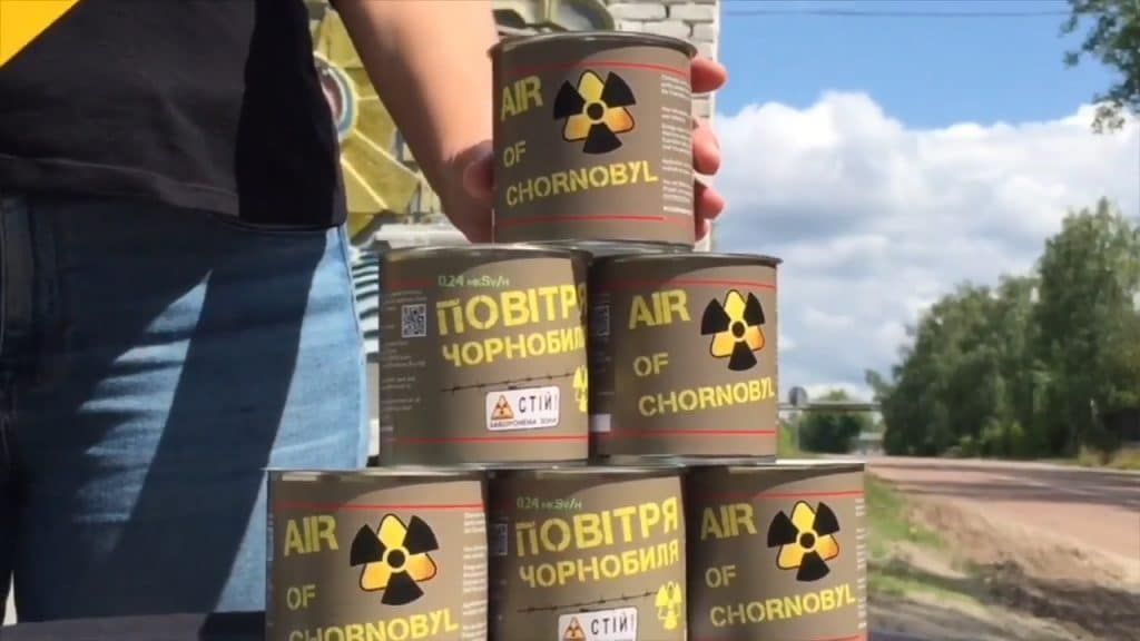
When the Banda designers were on the way out of the Chernobyl Exclusion Zone, they stopped at one of the many roadside gift shops that have cropped up in recent years. Some were shocked to find glow-in-the-dark condoms and “canned air” supposedly from the fallout site. “It was painful to see such disrespect,” Nesterevych said. Nesterevych and Shevchuk agree that the goal with the new Chernobyl logo was to keep the message positive, but also respectful of the lives lost and impacted by Chernobyl.
The Ukrainian government has an interest in reconciling sensitivity around Chernobyl’s survivors with international curiosity. Illegal tourist activity in the Exclusion Zone has happened before and since tourism was permitted, leading to potentially dangerous exposure to radiation, stolen artifacts, and severe injuries suffered when people entered structurally unsound buildings. Legal tourism allows for a controlled, less-exploitative way of appeasing curiosity. The government also realizes that many tourists, like the Banda team, often leave inspired.
“It’s not supposed to be entertainment. It’s an opportunity to understand the fragility of life, reflect on scientific responsibility, and a place to change your worldview,” Shevchuk said.
In the fall of 2020, the government opened nearly 30 miles of bicycle paths through the nature reserve that makes up more than two-thirds of the Exclusion Zone. Exclusion zone management is also working on kayak and helicopter tours that will explore the non-nuclear history and biodiversity of the area.
An official Chernobyl logo will give the government and licensed tourist agencies a unified look—especially online and in social media—and will enable the creation of official souvenirs that counteract the more vulgar ones.
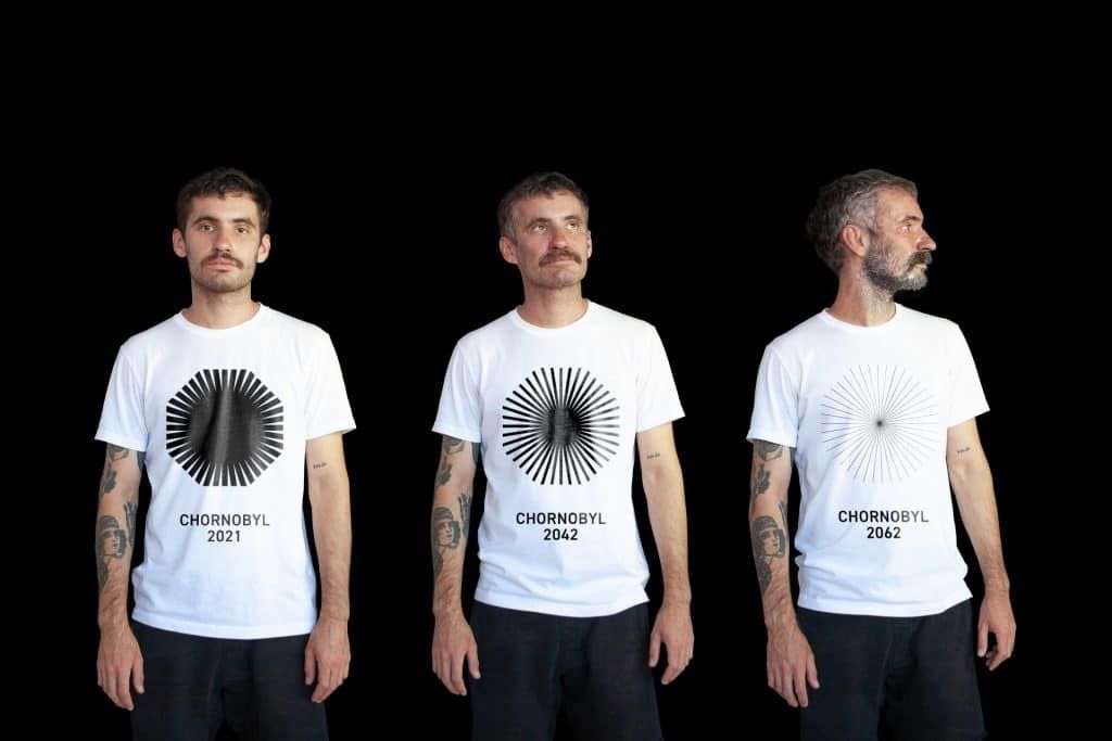
“We had this archetype of a tourist from Barcelona who would visit Chernobyl, buy a backpack with a cool design, return home to Spain, and talk about the symbolism with people who ask what it means,” Nesterevych said. An added benefit of the changing logo is that tourists who return year after year will have new souvenirs to take home.
“It's definitely strange, because most logos are designed to last, so that you only have to print stationery once every five years,” Vit said. “But when you only have to make a few hundred t-shirts every year, it’s genius.”
In 2021, Banda won a prestigious Graphite Pencil Award for the Chernobyl brand from D&AD, a global competition for advertising and design. The design firm and the Ukrainian government split ownership of the intellectual property equally and work together on licensing the brand to private groups that employ locals who have a hard time finding jobs otherwise. Many of the people who were displaced by the war in Eastern Ukraine now live near Chernobyl.
“It’s good for the local economy, since people in the area—farmers, hospitality workers, etc.—make money,” Shevchuk said.
A small percentage of every ticket sold through licensed companies feeds into Ukraine’s national budget, though its proceeds are not always redirected to the Exclusion Zone since the number of tourists fluctuates from year to year. In 2019, 100,000 tourists visited the Zone, with 80 percent coming from outside of the country, including 6,500 from the United States. In 2020, the number fell to around 30,000 because of the COVID-19 pandemic.
Shevchuk hopes people come back to Chernobyl to keep learning, exploring, and helping. He said the changing logo exemplifies the Zone’s ”movement from exclusion to rebirth and from darkness into light”—a sentiment that can inject a sense of hope into any disaster.
As the coronavirus crisis shows, we need science now more than ever.
The Bulletin elevates expert voices above the noise. But as an independent, nonprofit media organization, our operations depend on the support of readers like you. Help us continue to deliver quality journalism that holds leaders accountable. Your support of our work at any level is important. In return, we promise our coverage will be understandable, influential, vigilant, solution-oriented, and fair-minded. Together we can make a difference.
Keywords: Chernobyl, graphic design, nuclear tourism
Topics: Nuclear Energy, Nuclear Risk
Share: [addthis tool="addthis_inline_share_toolbox"]











“And in the aftermath of the reactor meltdown, a process identified by scientists as among the most “iconic natural experiments on rewilding in recent history” has led those forests to now teem with wildlife unlike any else seen in Eastern Europe. ”
Shorter-lived, more birth defects, extra heads? Let’s put a positive spin on an experiment in reckless-endangerment that should continue to be a warning, not a happy-face denial of harm done.
Given the puzzling lack of explanation of just what this logo is supposed to symbolize, other than the typical nebulous artist-speak ‘the changing logo exemplifies the Zone’s ”movement from exclusion to rebirth and from darkness into light”—a sentiment that can inject a sense of hope into any disaster.’, one is inclined to think that it is left up to the viewer. So here is one: The desperate hope of the Ukrainian gov’t that collective consciousness of the horror of Chernobyl will disappear over time. Light is electromagnetic energy, as is Chernobyl’s gamma radiation, which may not fade so quickly as… Read more »