Lost without you: The Bulletin's best maps of 2022

By Erik English | December 27, 2022
The year 2022 brought a lot of change to the global landscape. Armed conflict resurfaced in Europe; natural disasters took lives through flooding, starvation, and heat waves; and old rivalries were reignited.
The Bulletin has tried to shed light on these issues and to make sense of the new political map. To comprehend the magnitude of risk facing humanity in 2022, it is necessary to work with a great deal of information. Luckily, data has never been more available. If anything, the overwhelming amount of data can make it challenging to understand how it all comes together in a coherent fashion.
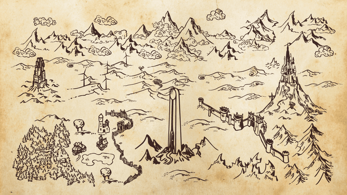
When writing about his process for drafting The Hobbit and The Lord of the Rings, J.R.R. Tolkien explained, “I wisely started with a map.” As a new multimedia editor joining the Bulletin this year, I’ve tried to do the same.
Throughout the past year, the Bulletin has produced detailed maps that use “big data” to demonstrate the existential risks facing humanity. Here are some of the Bulletin's more noteworthy maps from this past year.

‘Silent killer’: A series on surviving the extremely hot future
Despite record heatwaves across the world over the summer, 2022 is expected to be “only” the fifth or sixth hottest warmest year on record (compared to the 1850–1900 average). It was so hot, in fact, that notable climate skeptic and NYT opinion writer, Bret Stephens, took a trip to Greenland to see icebergs melting for himself.
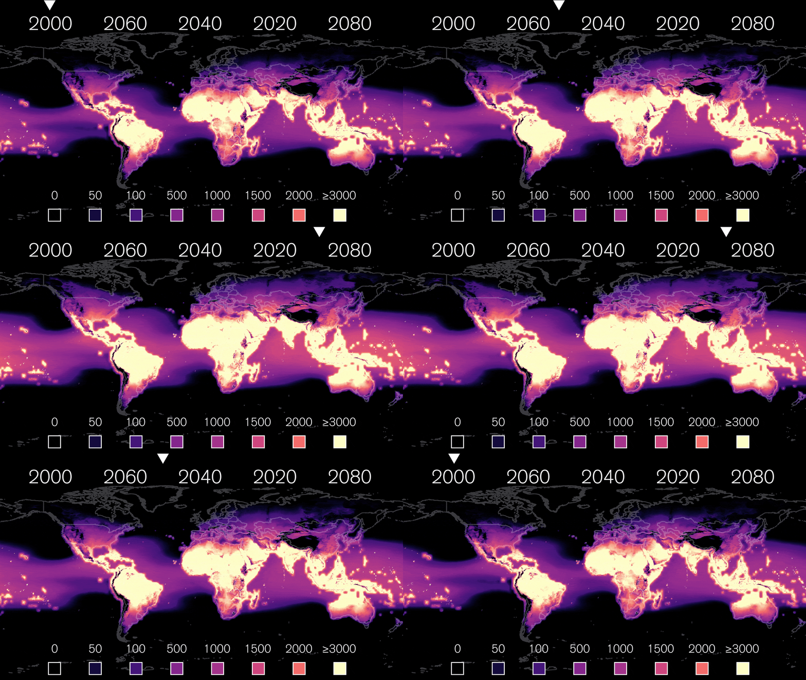
In July, the Bulletin published a series on extreme heat and its ramifications for the future. The series focused on cities, air conditioners, livestock, agriculture, and how to avoid dying of thirst. The second story in the series, from the Bulletin’s Dawn Stover, dealt with air conditioners and featured a map showing the projected change in cooling degree days—"a measure of the extent to which outdoor temperatures, over a given period, require indoor cooling for humans to stay comfortable”—between 2000 and 2080.
The map animation was created using Cooling Degree Days data from NASA, the World Resources Institute, and Resource Watch. The animation was achieved with QGIS and Adobe After Effects software.
In the midst of the historic heat waves around the world, the US Inflation Reduction Act (IRA) was signed into law in August, authorizing $370 billion in subsidies for clean energy in the United States. The legislation has been heralded as the largest clean energy investment in US history. However, as has been pointed out, with concessions made to Senators Joe Manchin and Kyrsten Sinema, the legislation is “almost all carrots, hardly any sticks.” The result of that compromise is more funding for carbon capture systems that have a poor track record and that many fear will only delay the energy transition and risk dramatic harm to the world by worsening climate change. Thomas Gaulkin produced this map to highlight the daunting task that still remains: transitioning away from coal-produced electricity in the US.
This map was created using Flourish software and data from the US Energy Information Administration.
While the world is still grappling to control the years-long COVID-19 pandemic, Paul Tullis looked at the alarming occurrence of bird flu in the Netherlands and around the world. The Netherlands, one of the largest producers of chicken eggs and meat, is also one of the more popular areas for winter migrations of birds. Paul explains that “As [highly pathogenic avian influenza] reassorts and mutates in various wild bird species, their constituents deposit novel viral RNA through their droppings into poultry farms.” The high density of chickens in poultry farms allows for avian flu to spread rapidly once it arrives.
This map was created using the Flourish platform and the UN Food and Agriculture Organization’s EMPRES Global Animal Disease Information System (EMPRES-i) dataset.

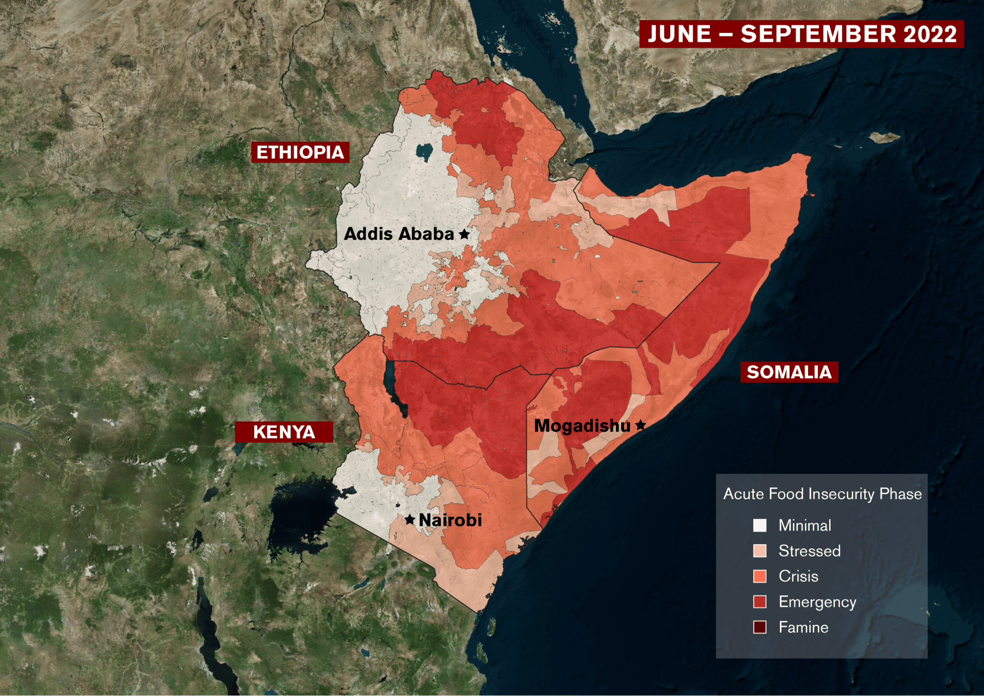
Fueled by food shortages, conflict, and a years-long drought, the humanitarian crisis in the Horn of Africa has been worsening throughout 2022, and some areas face the prospect of famine in 2023. The Bulletin published an article on the crisis in August, highlighting the need for urgent action to avoid disaster. Since that time, the situation has worsened, especially in Somalia. Food aid has increased across the region but not at sufficient levels to keep up with growing need. According to the Famine Early Warning System Network (FEWS Net), in Somalia alone nearly 8.3 million people are facing an acute food insecurity crisis. Many of the circumstances that were described in this article in August remain true today.
The map relied on data from FEWS Net, which was adapted in QGIS and Adobe Illustrator software. This article also featured a map that relied on data from The Armed Conflict Location & Event Data Project and was created using the Mapbox interface.
The Bulletin’s largest map project this year was the re-launch of the Global Biolabs mapping project, which tracks all the known biosafety level 4 (BSL-4) labs around the world. Through a partnership with Global Biolabs, the Bulletin redesigned and re-launch the map, which now also includes BSL-3+ labs. For countries with BSL-4 labs, the map provides scores that assess a country's approach to biorisk management and the country's national governance and stability.
The map allows users to investigate maximum containment labs at the global, country, and local levels—with zoom features and a wealth of data about every known BSL-4 and BSL-3+ lab.
The Global Biolabs interactive maps were created using a combination of datasets that are visualized using Mapbox. Promotional videos for the project featured maps created with Google Earth Studio and Adobe After Effects.