Visualizing the news from Ukraine
By Thomas Gaulkin | April 5, 2022
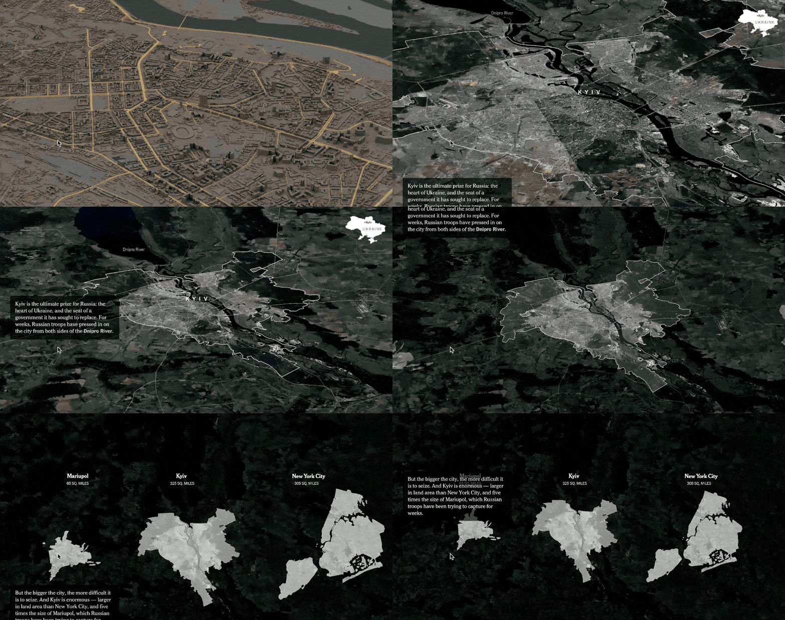
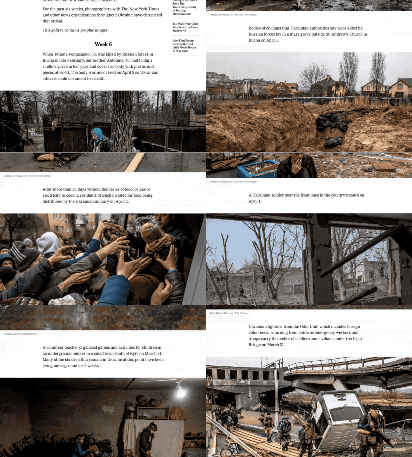
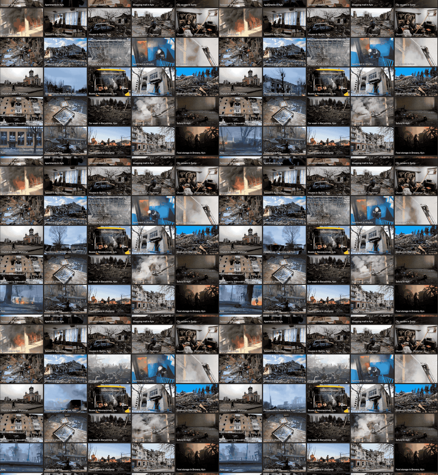 A grid of verified video of devastation in Ukraine compiled by the New York Times.
Russia’s invasion of Ukraine has been called the first social media war. For anyone vaguely aware of the conflict (even children), the constant stream of video carnage and horrifying tweets has been unavoidable and overwhelming since Russia invaded the country more than a month ago.
The extensive documentation of the war—supplied by thousands of smart phones, satellite imagery, unencrypted military communications, and open source intelligence—has also afforded news organizations an opportunity to provide more detail and context about events in Ukraine than in any war coverage previously produced. Visual investigation and graphics teams are more valued in their newsrooms than ever.
We’ve gathered some of the most useful and impressive multimedia stories, overviews, and graphics published about the conflict so far. From radio intercepts to interactive maps, these reports and explainers offer an immersive and accessible view of the war, and represent some of the best digital journalism constructed to address the destruction in Ukraine.
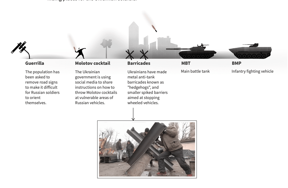
Waging war. One of the most surprising aspects of the conflict has been the overall effectiveness of Ukraine's defense against the invasion. Despite ostensibly mismatched forces and with Western military support confined to funding and equipment, Ukraine has limited much of Russia's movement around the country and into most major cities. These multimedia and video pieces help explain how.

This video produced by the New York Times' Visual Investigations team collates information from social media and official statements with Russian military radio transmissions during an attempted seige of a town outside Kyiv, revealing the disarray within the Russian forces.
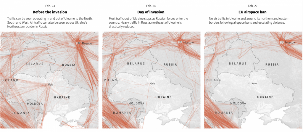
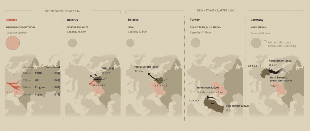
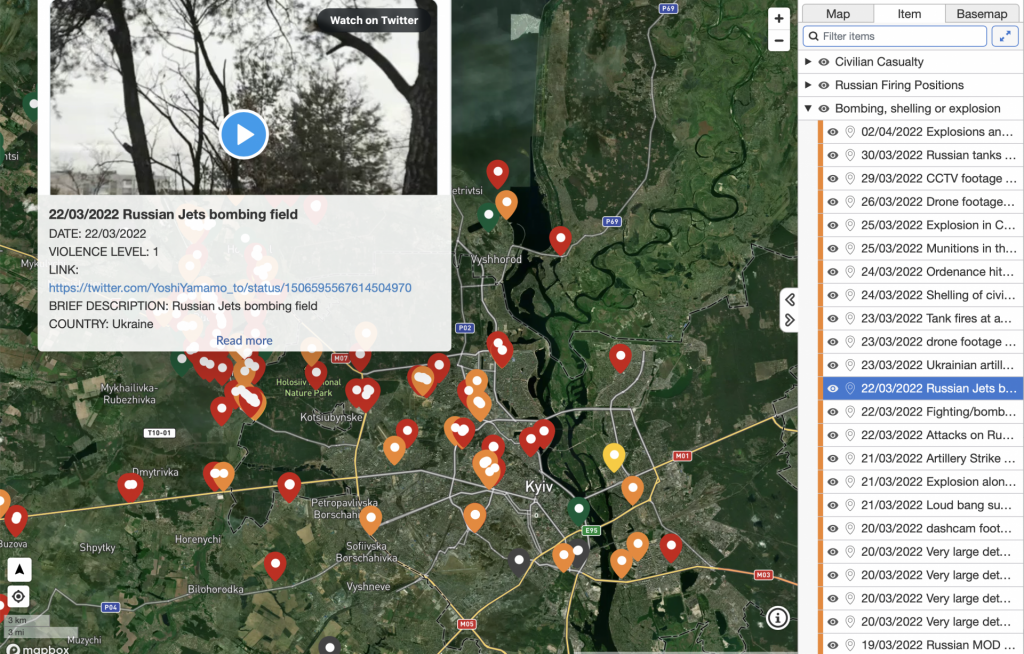
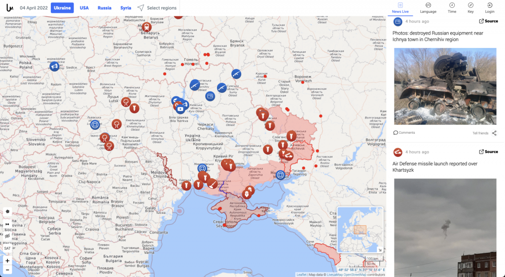
Maps. Like the videos and photos of wastelands left by Russian shelling and of civilians fleeing the devastation, maps of Ukraine are now ubiquitous. Many aren’t particularly useful. But some well-designed maps paint a digestible picture, with context, of the many factors influencing the conflict. Others are interactive and updated minute-to-minute, combining the geography of war with geolocated details of attacks and other events.
Reuters graphics team has a collection of pages with unique maps and charts that cover various factors influencing and influenced by the conflict, including energy, sanctions, weapons, and air travel.
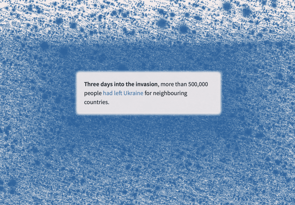
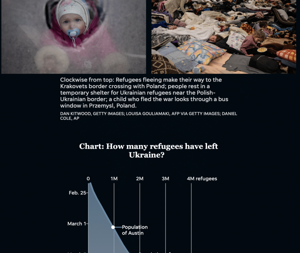
Humanitarian suffering. Russia's invasion created an immediate exodus of Ukrainians that only accelerated over time. According to the UNHCR, the UN refugee agency, more than 4.2 million civilians have left the country, and the UN's International Organization for Migration estimates that more than 6 million are internally displaced. These populations are escaping Russia's ongoing assaults on urban and civilian infrastructure, which have led to accusations of war crimes from world leaders and an investigation by the International Criminal Court. Numbers are never adequate to describe human suffering, but when news outlets juxtapose them with images in novel ways, the scale and misery of the humanitarian catastrophe is plain to see.
Picturing barbarity. Sometimes the most effective multimedia is the most traditional. The New York Times keeps a single page updated with the extraordinary images its first-rate photographers have captured of Ukraine these past few weeks. Scrolling through these seemingly endless photos of war is an unadorned interactive experience that can educate and appall, simultaneously.
Together, we make the world safer.
The Bulletin elevates expert voices above the noise. But as an independent nonprofit organization, our operations depend on the support of readers like you. Help us continue to deliver quality journalism that holds leaders accountable. Your support of our work at any level is important. In return, we promise our coverage will be understandable, influential, vigilant, solution-oriented, and fair-minded. Together we can make a difference.
Keywords: Russia, Ukraine, interactive, journalism, map, maps, war
Topics: Multimedia
Share: [addthis tool="addthis_inline_share_toolbox"]

