A site for sore eyes: The Bulletin’s best visual coverage of 2020
By Thomas Gaulkin | December 28, 2020

As multimedia editor, my main task is to help the Bulletin’s chief concerns—nuclear risk, climate change, and disruptive technologies—come alive on your screen in ways beyond words. This year we worked hard to expand on the new capacities built into our redesigned website, launched in 2018. Here are some of the best examples of what we did.
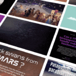
Now, next, and way back then. Beginning at the end of the year, the Bulletin’s December issue is an obvious place to start for highlights. After 75 years and more than 600 magazine issues (and covers), grave threats to humanity like nuclear weapons and climate change still warrant the Bulletin’s vigilant attention. Making the most of the new premium magazine format we launched in autumn, our December anniversary issue features an unparalleled collection of past and current contributions from early Bulletin supporters like Albert Einstein to Jennifer Doudna, co-winner of this year’s Nobel prize in chemistry for the discovery of the CRISPR gene editing technique. The anniversary issue cover and accompanying video teaser step through all eight decades of the Bulletin’s coverage to depict the long history of this publication and its impact on public discourse.
It is 100 seconds to midnight. Speaking of covers, the first real cover printed by the Bulletin was also the first appearance of the Doomsday Clock, which remains one of the most iconic graphic designs of the last century. Watching in January as the hands of the clock were set to 100 seconds to midnight—the closest they’ve ever been—was like seeing all the expert knowledge and analysis represented on this website every day distilled into a single tableau. That’s something unique in the world that the Bulletin produces year after year.
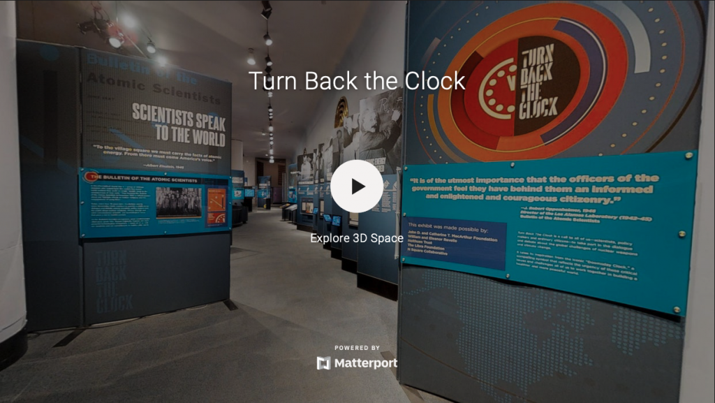
This spring the Bulletin launched a virtual tour of “Turn Back the Clock,” an exhibit formerly on display at Chicago’s Museum of Science and Industry. Now anyone, anywhere in the world, can walk through the history of the Bulletin since its founding and through the various settings of the Clock, view fascinating artifacts up close, and experience what museum-goers saw without getting out of their chairs. That goes for you too—take a look!
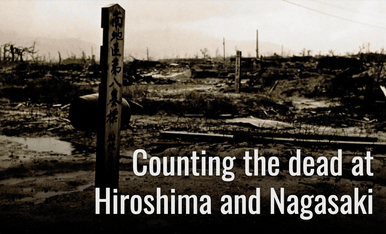
Multimedia features. 2020 also saw the commemoration of important events far less auspicious than the Bulletin’s founding. July 16 was the 75th anniversary of the first nuclear explosion, the Trinity test in the Nevada desert. Scrolling through the always sober and sometimes studiously introspective comments of the Manhattan Project scientists and soldiers who witnessed the test is almost like reading their diary entries, or a real-time Reddit thread on the dawn of the nuclear age—something you will actually never find anywhere else online. Similarly, Alex Wellerstein’s history of attempts to count the casualties of the Hiroshima and Nagaski bombings a month later in August 1945 offers a grim but essential exposition of the immeasurable toll taken by these weapons and the uncertainties that still linger today.
These and other major feature stories gave articles we published a visual dimension in ways not seen since we stopped printing glossy pages in 2009. I encourage taking time with all of them, including Paul Tullis’ report on the emerging technology and less clearly emerging ethics of brain-computer interfaces; contributing editor Elisabeth Eaves’ visit to the US biodefense facility being built in the heart of Kansas; my own chronicle of US influence on the World Health Organization; and our collaborations with the Medill School of Journalism that transport you to melting Mongolian glaciers and the contaminated battlescapes of Iraq and Syria.
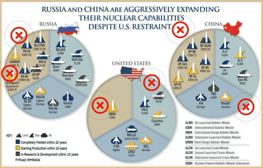
Showing and telling. Along with magazine-style features and layouts, this year the Bulletin found nimble ways to illustrate the news, like timelines following the Trump administration’s shifting negotiating tactics on the New START treaty with Russia as well as the interesting coincidence of milestones in Donald Trump’s life and American nuclear weapons policy. Editor John Krzyzaniak added interactive annotations to an official infographic by US Strategic Command that grossly misrepresented global nuclear arsenals, demonstrating how it can often be more effective to show something directly than simply explain it.
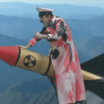
Tracing failure. It’s practically impossible to highlight the best of anything in 2020 without talking about the worst thing about 2020—the pandemic that, with any luck, is approaching its apogee one long year, one and a half million deaths, and 72 million cases after the novel coronavirus first began making headlines. One of the starkest visual metaphors for the mishandling of this global health crisis was the image of Donald Trump tearing the mask from his face after testing positive for COVID-19. That single moment probably captured the failure of international leadership against the catastrophe better than what any journalist could have engineered (though I humbly recommend my highlight reel of pandemic hubris).
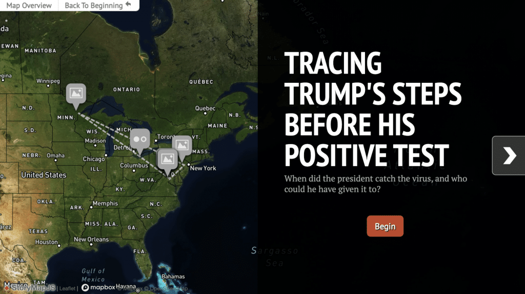
All the same, Trump’s diagnosis did lead to one of my favorite examples of the Bulletin’s visual storytelling this year. Immediately after the president announced his positive test on Twitter, deputy editor Dan Drollette tracked his movements over the previous week. The accompanying interactive map we published within hours efficiently detailed Trump’s continued travel and interactions even after he knew he was infected.
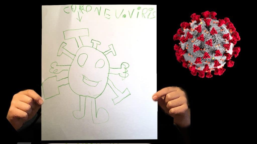
Seeing small, seeing big. There’s hope now that the COVID-19 pandemic will quickly follow 2020 and come to an end. But the image of that strange ball covered in glycoprotein spikes—made famous by Centers for Disease Control and Prevention (CDC) artists Allisa Eckert and Dan Higgins—will remain burned into the world’s collective visual cortex for decades to come. After the DNA helix, I doubt there is another microscopic entity whose depiction has ever been more iconic.
Well before COVID-19 was even declared a pandemic, that CDC visual of the virus had begun reaching into households worldwide. As it did, young children found ways to translate what they were seeing and living into pictures, as they do. Many parents posted their kids’ artwork online. For one of the Bulletin’s most widely read pieces this year, I collected examples of children’s novel coronavirus art, and spoke with several experts who study how young people cope with traumatic events. As psychologist and child trauma researcher Chandra Ghosh Ippen told me, “In drawings, you can do things that in life you can’t do. You can have the coronavirus be a thing. When you personify something, when you give something a body, you’re able to talk about it, you’re able to manage it. In play, kids are able to beat it up, they’re able to jail it, they’re able to yell at it, they’re able to say, ‘Hey, you go away!’”
I suspect we may all share that sentiment as we watch this year finally come to an end and look forward to new vistas in 2021.
Together, we make the world safer.
The Bulletin elevates expert voices above the noise. But as an independent nonprofit organization, our operations depend on the support of readers like you. Help us continue to deliver quality journalism that holds leaders accountable. Your support of our work at any level is important. In return, we promise our coverage will be understandable, influential, vigilant, solution-oriented, and fair-minded. Together we can make a difference.
Keywords: Multimedia, Virtual Tour, best of 2020, infographics, video
Topics: Multimedia
Get alerts about this thread
0 Comments
Oldest

Thomas Gaulkin
Thomas Gaulkin is multimedia editor at the Bulletin of the Atomic Scientists. Prior to joining the Bulletin in 2018, he spent the... Read More